Portfolio
PLEASE NOTE - I am currently not accepting new site requests, as I am focusing on my full-time web dev job.
Check out some of our previous work. Click an image to visit the site.
Irish Slang
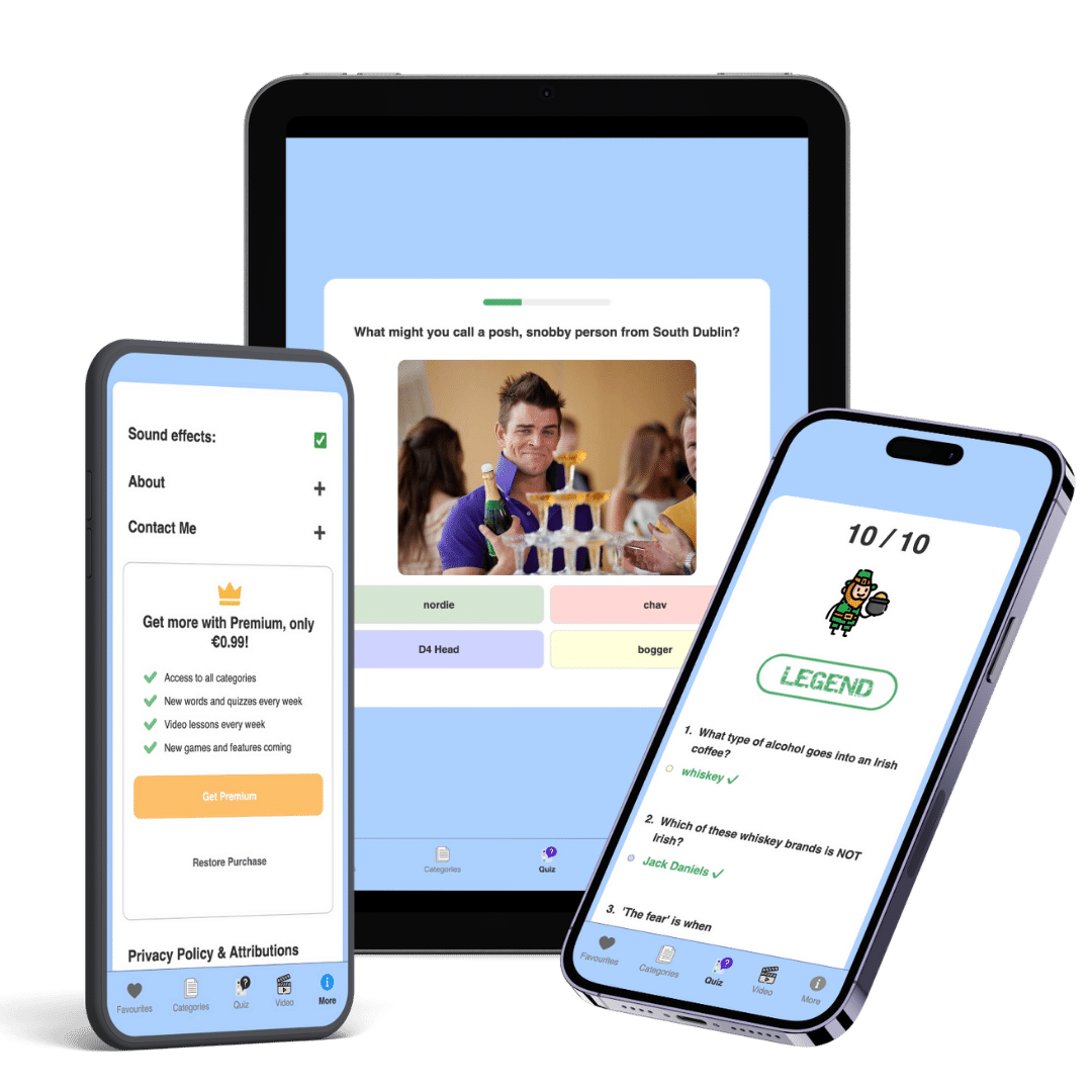
I started creating this app in early 2022 as a side project to help me learn some of the technologies I was using in my new job. These included Pug, Vue, Nuxt, and SCSS. By utilising Capacitor, Xcode and Android Studio and by tinkering with the CSS, I was able to make this web app look and feel like a native mobile app.
The app contains over 500 Irish slang words, along with explanations, audio clips and images, and a search function. There are quizzes and games to test your knowledge, and videos for educational and entertainment purposes.
By utilising local storage, the app saves your favourite quotes, and remembers your sound preferences.I plan to add more content and features regularly.
The app is primarily designed for phones and tablets, but can be used on desktops too. It is available for free download on the Apple App Store here and on the Google Play Store here.
Hot Chip
A Covid-inspired startup, Hot Chip cookies originated in Dublin and are now sold all over Ireland. As demand for online orders grew, there was an increasing need for a website with a simple but capable cart system and a smooth checkout process. I decided to move the site from Wordpress / wooCommerce to Shopify.
This move coincided with the companies re-brand. I received a PDF from the in-house designer with the companies new logo, brand colours and slogans. With this info, I set about designing a site which would showcase the cookies as much as possible, but also make it easy for customers to find the info they need.
I utilised some custom liquid code where the theme needed to be edited, third party apps to allow for a variety of order types, customised e-mails and some photoshop for the png images . Online orders have been flooding in and customers have been very happy with the new site and streamlined ordering process.
Tame Roofing & Building
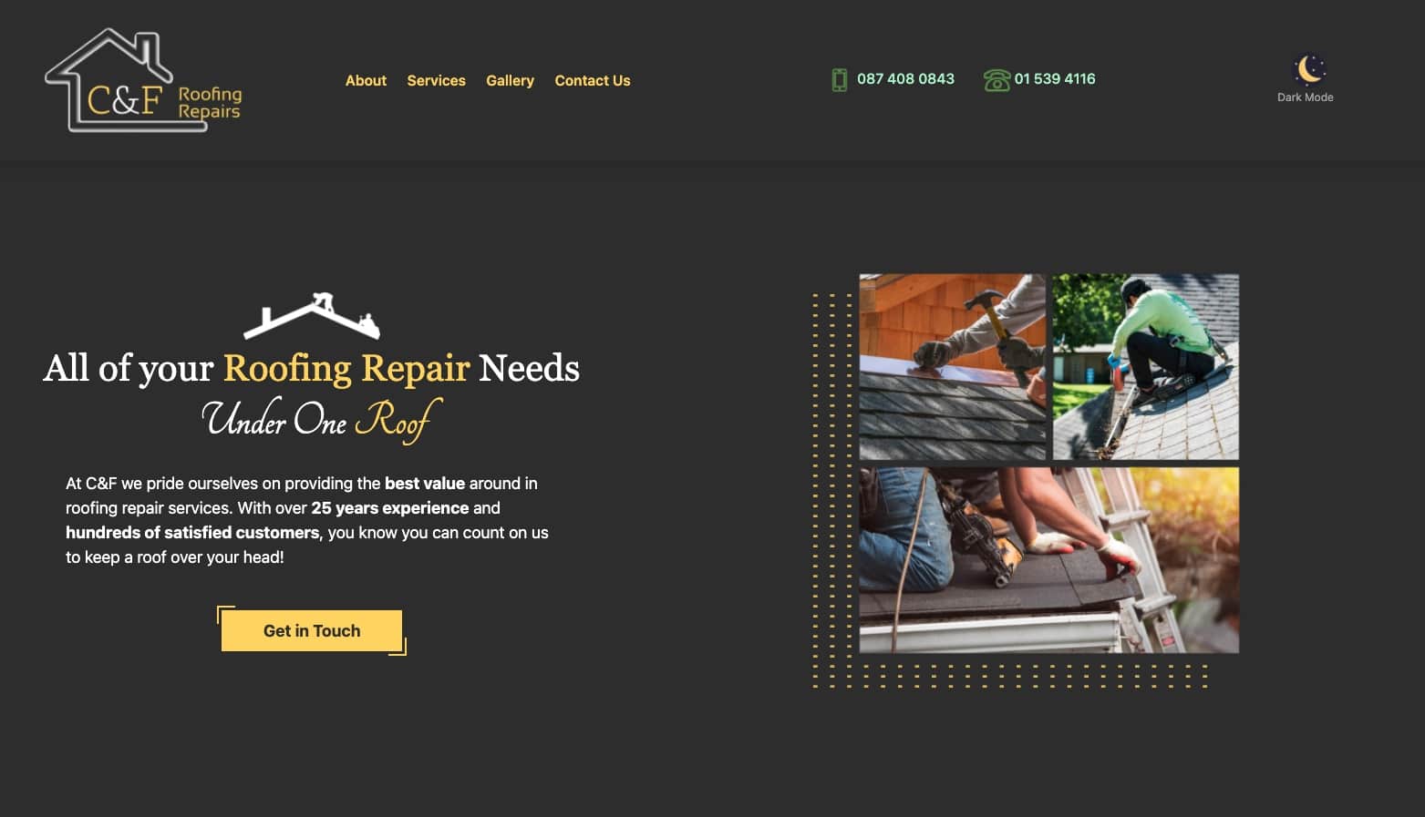
Before we got in touch, Tame had been operating for 25 years, but had never had any internet presence, not even a Facebook page! We knew creating them a nice, modern site would help bring them into the modern world, and bring in lots of new clients.
We mocked up a stylish design using Figma, presented it to them and got started on building a site from scratch. As they had never been online before, we had to work hard at writing engaging, original copy, tactically using stock images along with the few mobile camera shots they had, and conveying the business as well-established and professional.
Within 10 days we had built a site that looked great, loaded quickly, gave all the essential info about the company, and scored extremely well in performance tests in tools such as Lighthouse and PageSpeed Insights. The site is fully responsive, SEO-friendly, highly accessible to all users, and has some design features that are rarely seen in small business websites, such as a dark mode.
Central Landscaping
Whilst searching for businesses in need of help, we noticed that Central Landscaping had an up-to-date Facebook page, active Instagram profile, and plenty of positive reviews, but their website was down. We gave them a call and they said they'd had issues with their old site and the developer wasn't answering their calls or emails. We said we'd love to help and had a chat about the company and their goals, then agreed on a price and got started on a design.
In many ways, Central Landscaping were the ideal client to work with, as they already had images, testimonials and some info about their history and services. This sped up the development as we could focus mainly on the design and performance of the website.
We looked at many landscaping websites for design inspiration and tried to make the site stand out from the generic, cookie-cutter templates that many small businesses use. We created a new logo from scratch, as their old, red coloured logo didn’t fit in with the theme of the site. We sent over an initial mock-up on Figma and made changes where asked.
The site is highly performant and scores nearly perfectly on a Lighthouse audit. There are links to the companies social media accounts, and links for customers to leave Facebook/Google reviews. The company now has a site that represents their brand and values well, and this should lead to much more converted customers.Crezo Construction
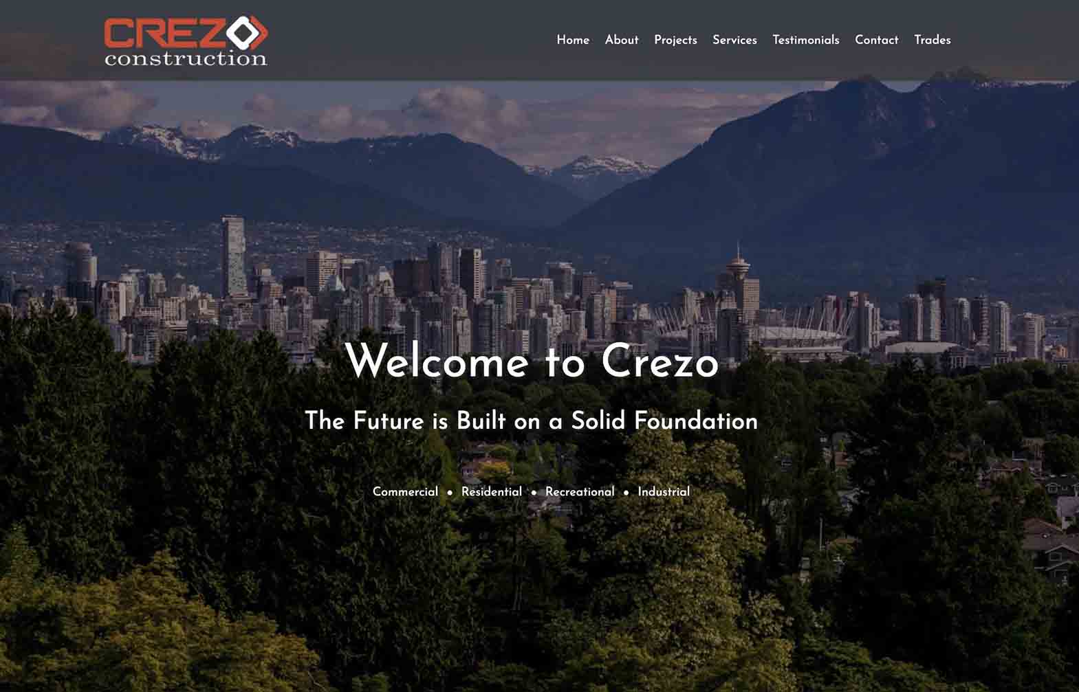
We made this site for a small construction company in Canada. We replaced their old Wordpress site with a more modern version using some newer technologies, Gatsby.js and a Content Management System called Contentful.
Using Gatsby really helps on the performance and user experience side of things. When you click into the "More Projects" section, for instance, rather than loading a whole new page, only the projects component gets loaded, but the header and footer remain visible on the screen. This wouldn't have been possible in the past, using regular Javascript. Gatsby also allows images and content to be loaded through GraphQL, which speeds up loading times and allows images to load at different resolutions, depending on the user's internet speed.
Linking the site to Contentful allows the company to update their content on their own, without relying on a developer. In terms of the visual side, we followed the latest design trends to give the site a sleek new look, in line with their brand colours. This has led to a much improved user experience and reflects better on the company.
Cosy Cabins
This is a mock-up website for my brother's business idea. The company is a bit like Air BnB, but specialises in off-the-grid cabins. Built using React.JS, we tried to convey the overall ethos of the company with the minimalist website design.
The site contains image galleries, a blog, 5 day weather forecast using API, and some quirky animations. To save myself rewriting multiple cabin descriptions, I used React/Javascript logic to plug in the correct props, such as price, location, distance and facilities.
When the company launches, I will add a booking / payment system to the site.Networkers
This was our first project built using React. As the site features over 30 detailed worker bios, rather than writing each one individually, I wrote a few generic templates and coded a javascript function to alter the bio properties depending on which profile is selected. This means the names, gender pronouns, professions, costs and images will automatically change depending on what profile is being viewed.


